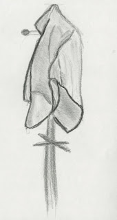
this study has some good observation here we get a good sense of form and how the drapery folds, although the drawing could of included the object it was resting on (chair, door etc) as the image just seems to be floating or very least shaded in the background to get rid of the white void. there are some nice lines used here, there are some harder lines to indicate the folds in the drapery however there may be to many as the fabric is soft and bends so perhaps using the charcoal more softly could help to improve the image. but the shading is very well done there is some soft lines to show the crease in the drapery and verity of different values such as the darker values in the centre which show the form shadow on the folds, we can see the values decrease as you move away from it. although the shading doesn't blend in with the rest of the shading and seems to be a outline of the shadows, these need to blended together.
this image has some improvements over the above image such as the addition of the chair which the drapery is lays on and shading around the chair so the drapery doesn't look as if it is floating in space. the lines are similar as to the above image, the darker lines help to indicate the folds in the drapery and help it stand out from the form shadows. the shading are far to dark, outlined and don't blend at all with the rest of the shading in the image.
first off with this image is we have the addition of the pole the drapery is over,as you can see at the top of the image how the drapery folds over the top of the pole which helps indicate where the pole is but also how the drapery folds around it. there is some good lines here at the top of the pole and down the right side of the image we have a soft line which does help to show the soft fabric of the drapery, however some of the darker lines at the bottom do contradict that, these areas should of been lighter.


No comments:
Post a Comment