Tuesday 7 May 2013

foreshortening-figure drawing


here is a few quick sketches of some foreshortening effects before trying to implement them into figure drawing. 


this sketch is first attempt of some foreshortening on a skeleton. the drawing is very basic there isnt much shading, its incomplete and the rib cage is very basic and there doesnt appear to be much of foreshortening affect.   

here there is some improvement on the drawing, their is some shading added to the image to give it some form, there is a little bit of foreshortening effect with the rib cage down although more detail needs added on the hands and the spine is far to straight and doesnt curve at all.

figure- pose, balance, weight


this figure sketch has some good pose we can see the figure is sitting down with his hand on his lap, have a good sense of balance and weight as the balance we can see the weight on this sketch is down as the  figure is just sitting. some ok shading majority of the figure isn't shaded but there is some such as the arm and the back which have some dark values. although there needs to be more shading throughout rest of the image. 


there is a nice sense of pose in this sketch as we see that the figure is laying down and supporting her head with her hand. the proportion is off the arms and legs are too thin and the arms seem to small when compared to the torso. there is some nice shading on throughout the image for example on the shoulder has so good shading which helps to create some form on the figure. although some areas which need improving is the proportion and there is some sausage limbs.   


this figure drawing needs some work the proportion on it is off, there is also disjointed limbs such as the right leg. the head seems far to small and there isn't enough shading on the torso. although we do get a nice sense of the pose of the figure we can see the that the figure is sitting with crossed legs and appears to be holding something. there is some nice shading around the legs which gave them so form.   


landscape colour

this landscape has a verity of man made and natural elements as we have the boat, bridge as well as water and trees which helps to create a balanced and interesting composition. there is a little bit of a foreshortening affect as the path and the black pole becomes shorter the further way it gets. there is some implied line and actual line through out this image such as the bridge has an actual line which can be followed, the curve in the path also draws the viewers eye. 


this image of a bridge doesn't have much the main focus point in this image is the bridge with the water being area of interest, viewers eye will follow the curves in the archways across the image which creates an implied line. the colours are used quite well the blend between green and blue help create a murky look to the water. the bridge has nice arrange of colours however there should more detail needs to be added to the bridge to make it more appealing to the viewers.   


the house in this landscape sit more or less in the centre in the image which makes it a focus point of the image however it does create a boring compositing if the focus point is centralised. their is some man made and natural elements to this composition, there is a lot of impressionistic drawings of the leaves bushes and grass with in this image, the viewers eyes can follow the leaves on the trees and the bushes across the image which creates some implied line. the perspective on the building is off for example  the roof of the small section of the building shouldn't be viable . 


final piece 1- figure drawing


this figure drawing has a nice pose, we can clearly see that the figure is facing towards the viewer and movement in the hands show the figure is drawing and holding the book steady.the proportion on the figure seems accurate the hight and with of the body look within proportion, however I think the width of the left leg is slightly higher than the other leg. some areas which need improving is the head, there is a little detail such as the hair, but face is just blank thats one area that needs work, also the arms dont show any muscle structure and are sausage limbs. there is some shading within this image best use of it is on the right leg where is shows the knee and the back of the knee, more work needs to be done on the clothing such as any creases or folds in the clothes there is a little bit such as on the back but more needs to be added.

final piece 3- still life


this still life arrangement has some good qualities, we have a good sense of form and shape, a majority of the objects in this still life can be easy recognised, the shading on the objects also help to create the form of the objects for example the camera case has cross hatch shading which helps to show the texture and stitching of  case, some of the vases show their reflective surface, as you can see the two vases in the middle have some darker values which show the reflective surface. the main focus in this composition are the 3 vases as the sit in the centre of the rule of thirds making it the main focus for the viewer. there is some implied and actual line within this image, the implied line is evident from following the tops of the 3 vases and the actual line can be seen from the froth vases which has a strong line which connects the whole image together. the drapery is well drawn you can see how the drapery folds across the surface, there is some shading event which helps to create the form of the drapery some lights shaded lines help to create some of the folds in the drapery so it doesn't look like a flat surface, there is some darker values on the bottom of the drapery which shows some of the shadows. the composition is well balanced the 2 cube like objects (case and candle holder) are on opposite sides to one another which helps in balancing the composition.some areas do need improvement such as the bowl like object in the centre which is the weakest drawn object. the shading also need improving some of the objects have even values and don't show any evidence of shadows but other objects such as the vases have some nice shading such as the dark values across the side of the vases showing the shadow of the other vase and also some nice shading on the base of the surface which appears to be reflecting the surface.  

final piece 2- landscape


this landscape drawing has some good aspects with in it  such as the impressionist drawings on the leaves, flowers/ grass which help give form to the landscape, there is some depth in the image with the foreground (bushes stairs etc) and background (smaller trees) helping to create a sense of depth within the image such as the background trees are smaller and to give sense that these tress are further away from the viewer. there is some implied line through out the image which guides the viewers eye, the bushes and the trees have implied line. the top of the bushes have lines which go from the left side of the image to the right which guide the viewers eye across the whole image, there is also implied line on the tops of the trees. you can follow the top of the tree on the right and follow it to the tree in the centre of the image. the front face of the building in this image is in the centre of the rule of thirds and the rest of the building is within the left side of the rule of thirds this makes the building the main focus point in the image, other areas of interest within this image is the tomb stone and the large tree.  there is some shading though out this image for example the building, there is some different values throughout the building such as the roofs which have darker values than the walls, however there isn't much verity in the buildings tones as some bricks would be darker than other which isn't evident in this image. the tree and bushes do have some nice verity of values, the bushes have darker values at the bottom then proceed to get lighter. the tree has some nice shading, one side of the tree appears to have darker values at one side of the tree showing that it isn't get as much light and as you go up the tree some of the branches do have some very strong values which helps to create the form of the image. there is some areas which need improving such as the detail on the building, more detail should been added such as the brick layout,  some of  the architecture is evident such as the windows and the front entrance although the side window isn't well drawn and seems out of place the perspective on that window is off.          

Monday 6 May 2013

figure drawing.


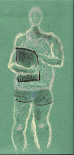
this image has some nice shading here the white pastel helps to showcase the highlighted areas in the skin from the light source, the left side of the figure isn't getting as much light so we have much darker values. the proportion on the figure is a little off the torso is a bit to long, but we do have a good pose here we get a sense of the curve of the spine  and can see that the model has his hand on his hip and his right hand appears to be holding on to something.  


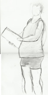
this figure has better proportion than the previous image, we have a good sense of pose as we can see the head is angle towards the viewer as if the figure is look directly at you, the hands also indicate the pose of the  figure, the hands show that the figure is drawing on a sketch pad and, we also have the curve of the spine however the spine seems to curve too much in this image. there is some slight shading on the figure such as the vest, arms and we have some strong dark values on the underwear. one aspect which could be improved can be the face, more detail such as eyes nose mouth need to be added to make the figure look more human at the moment it just has the hairs.     


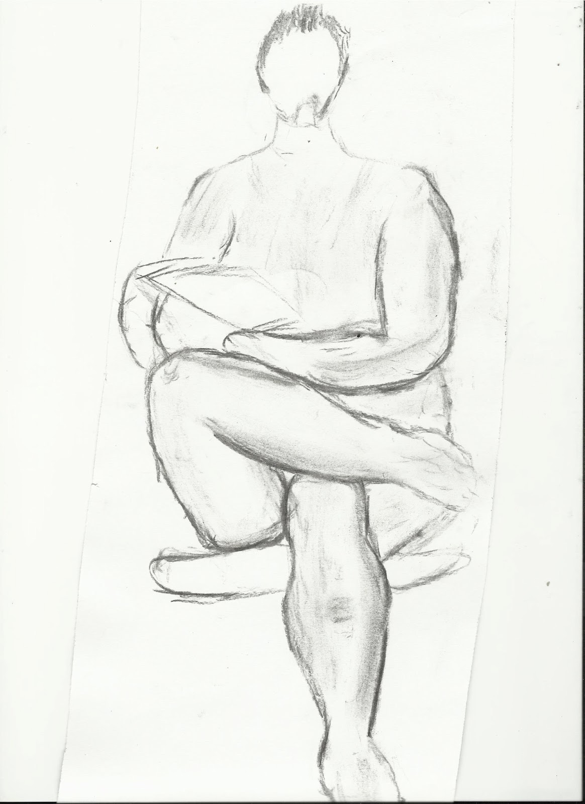
this figure drawings has some good proportion, arms stay consistent they are same hight, same for the legs, although the left shoulder seems to be a bit disjointed. there is some shading evident in the image, the cream pastel has been used the darker areas of the body which are visible such as the knees and elbows, some darker values which are represented by black pastel help to show some of the shadows such as under the neck there is a strong shadow present. areas which need improving are the head this one has no features so it looks very lifeless, this is an area which needs work on.    


week 11 modern architecture


 this drawing has good composition as we have some depth with smaller buildings in the background which helps add more detail to the overall image. the curved building is in the foreground help balance the image which makes it more appealing to the viewer and adds another layer of depth to the image. and the mid-ground of the image becomes the main focus point as the image has some added detail with the buildings windows they have been drawn with more detail however the values on the windows are the same through out, some of the window panels could of been improved by adding  different values. there are some line and implied line within this image. the tops of the buildings have actual lines which guides the eye from the top left of the image to the right of the image. the curve on the building in the foreground is an implied line as your eye would be inclined to follow the curve which will lead the eye across the image. there is some slight shading here such as the ground there is a strong dark values to indicate the shadow of the curved building however the shadow is far to dark and doesn't blend with the floor well, the shadow should of been lightly inked in.there also could of been a bit more added detail in the the rest of the buildings such as the curved building.     

Thursday 25 April 2013

Non human anatomy


the eagle has some basic shading there isnt much verity in the shading area although there are some strong which help to distinguish the outlines around the eagle wings. there is some aspects of pose as you can see the eagle's head is turned. areas which need improving on are the shading on the feathers as the lack of any shading doesn't help create any form with the eagle and cant  distinguish any of the eagles feather patterns.

this drawing of a squirrel has some good proportion , their is some nice detail on the head we can see the whiskers. nose etc making the image look more alive. the shading is shows areas of the fur which has darker values than others such as the top part of the squirrel and the bottom of the tail show the darker values. the darker lines on the hind leg help to indicate where the leg is.      


this drawing of a tortoise has some nice shading around its shell which show cases the tortoise pattern on his shell. we also have outlines of the tortoise's shell pattern as well. there is some good form on  the legs as it show off the scales of the tortoise. some areas which need improve on is the head, the head is very basic more detail needs to be added.     

figure drawing week 8 directed study


this study has some nice shading such as around the bottom of the foot and ankle which helps to create some form on the foot, their is some light yellow shading throughout the which indicates some of the skin and also some of the vains in the foot. some areas which need improving on is the choice of coloured paper or pastel  the yellow pastel is to bright which makes it hard to see the toes but can just make out the outline of the of the foot.    


these studies have same problem as the previous with the yellow pastel makes it harder to see the detail on 
the foot, the top study isn't that accurate but there is some nice shading, the back of the foot has some gentle shading and blends well with the image, we also have some strong darker values on the ankle which is to show off the form of the ankle.  


there have been some improvements here such as the use of different colour pastel making easier for the viewer to see. the left foot has some nice shading, the values gradually change for example side of the foot has darker values and the values being to get lighter. some of the toes need improving as last 2 seem to be same size. the right image is a side view of foot. the proportion on the foot needs some improving as the width is too short.    


Classical Interior architecture

this is a good composition for interior architecture. it's at an angle giving the image a more 3D effect as we can see though the archways. there some good textures here such as on the stairs and arch way the curved line help to show the curves in the architecture such as the archway the line curve inwards to show how the form of the arch. there is is some shading on on the archway, the stairs and the top of the image, however these are the same value and don't indicate any light source also the the inner part of the image doest have any shading so it doesn't show any form of the architecture.

composition focus

this still life arrangement has some good aspects to it, such as the vase is in the centre of the rule of thirds so becomes the focus point of the image and the three other objects become areas of interest. the sideways vase helps to connect the other objects as the image has an actual line so your eyes will follow across the image. one thing which can be a problem with this image is the fact that there is an even number of objects on the table so your eyes will could pair each object up to one another. the shading is well done we get some nice reflections on the vases such as the middle you can see the reflections of the two vases has darker values to so the refection and you can even see how the reflections curves into the vase. however I think that some areas could be improved such as adding another object on left side to make the image more balanced and to move the small jug close to the large vase as the two objects are near kissing.        

light and shade


 this study has some good observation here we get a good sense of form and how the drapery folds, although the drawing could of included the object it was resting on (chair, door etc) as the image just seems to be floating  or very least shaded in the background to get rid of the white void. there are some nice lines used here, there are some harder lines to indicate the folds in the drapery however there may be to many as the fabric is soft and bends so perhaps using the charcoal more softly could help to improve the image. but the shading is very well done there is some soft lines to show the crease in the drapery and verity of different values such as the darker values in the centre which show the form shadow on the folds, we can see the values decrease as you move away from it. although the shading doesn't blend in with the rest of the shading and seems to be a outline of the shadows, these need to blended together. 

 this image has some improvements over the above image such as the addition of the chair which the drapery is lays on and shading around the chair so the drapery doesn't look as if it is floating in space. the lines are similar as to the above image, the darker lines help to indicate the folds in the drapery and help it stand out from the form shadows. the shading are far to dark, outlined and don't blend at all with the rest of the shading in the image.   


first off with this image is we have the addition of the pole the drapery is over,as you can see at the top of the image how the drapery folds over the top of the pole which helps indicate where the pole is but also how the drapery folds around it. there is some good lines here at the top of the pole and down the right side of the image we have a soft line which does help to show the soft fabric of the drapery, however some of the darker lines at the bottom do contradict that, these areas should of been lighter.   

mass, form and shape


this still life has some good shape and form. the shape is well described we can understand what the objects in the image are. the ball and jug have some good form, the shading on top of the image describe the form of the ball as the shading is curves into the ball, the darker values in the ball help show the reflective surface the ball has, the reflections also curve into the ball. the images do have some depth to it as the the jug and vase are in front of the image such as the darker lines on the jug to help show the object is in front. this still life is well balanced, the ball is the focus point as it sits in the centre of the rule of thirds so the eye is focused at the centre. the eye also follows the curve of the ball which connects to two objects together. there are some areas which need to be improved such as the handle which appears to be slanting a bit and some of the shading on the bottle need improving.

figure

this image of s skeleton has some good proportion  body is right height and width, the we can see the curve of the spine. some areas which need improving is shading as there is a lack of shading within this image, also detail needs to be added to the skull as this moment its just an outline of a skull.   


this is a study of a skull, the skull has some good form and shape, its easily identifiable the skull is in proportion and we have some nice added detail on the skull with the cracks on the top of the skull. some areas which require improvement are the eye sockets  as the shape and hight are off slightly this areas does need some improvement although the space between the eyes are right distance. some shading is require on the teeth, one area which should be done next time if the artist wishes to draw another skull is have a different perspective as the skull is just straightforward and looks very flat next time go for a more 3D perspective   


this skeleton has some nice bit of detail on the skull for example the outline and also the detail such as the jawline and teeth. some shading has been used here as well, some of the ribs on the chest have lighter values than others as well.